
The ECFA held a public logo design competition in 2020, with Lachlan Bell announced as the winner. Below Lachlan describes his approach and inspiration in designing the ECFA’s new logo and brand identity.
“When approaching the new ECFA logo, the brief was clear. Convey the identity and objectives of the Estonian Cultural Foundation of Australia. With this came its own challenges of embodying the values of the foundation within this new logo, primarily the promotion and preservation of Estonian history & culture and the facilitation of cultural exchange Australia-wide and abroad.
Taking a future-oriented approach, I considered what the ECFA looked to embody within the next decade and beyond and how this could be conveyed through the design, one of the most foundational parts of any organisation. Themes of inclusivity, protection, approachability and adaptation became the cornerstones of my design approach.
With this in mind, I chose to incorporate these different ideas, starting with the main central graphical element. Familiar to many Estonians, the circular shape is based on an abstracted minimalist brooch (sõlg), one of the oldest and most common type of jewellery found across Estonia and surrounding regions.
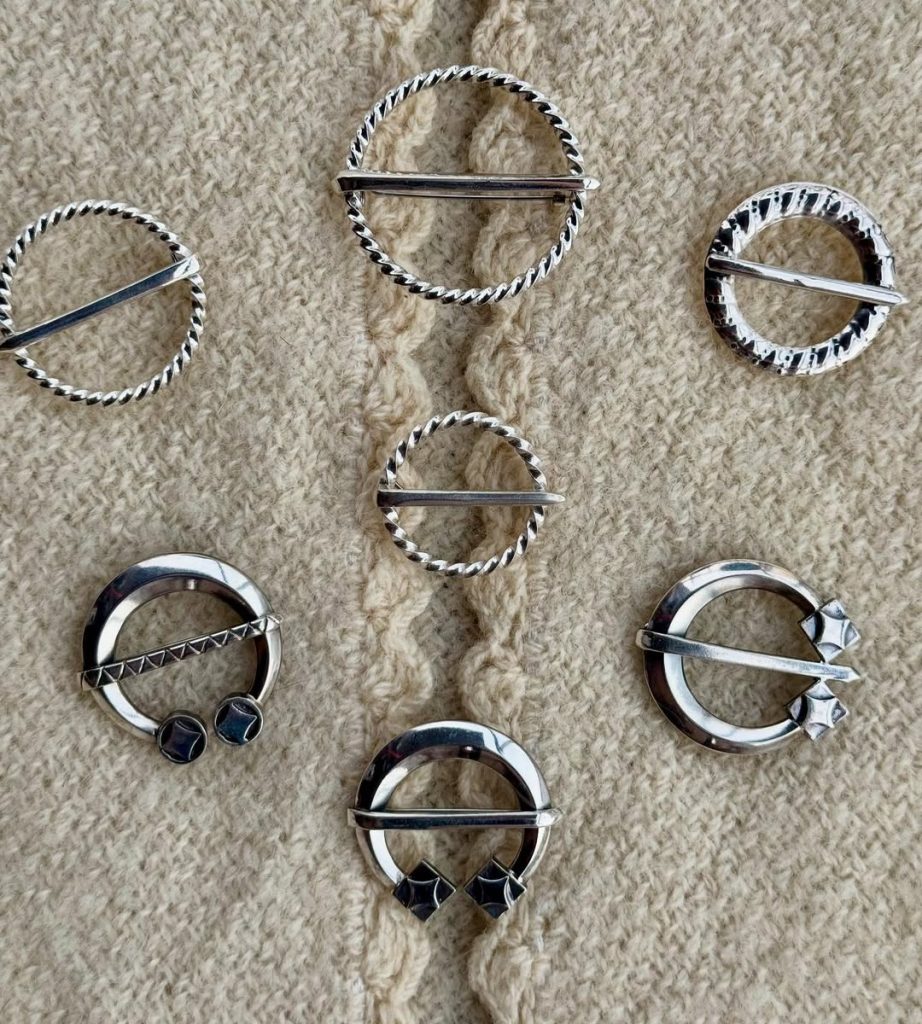
Historically the sõlg was used for fastening clothes; however it came to become an indicator of wealth – traditionally made from silver – and as a protective object. The introduction of button fasteners in the Middle Ages replaced brooches (sõled) as fasteners, however they remained important due to their protective and empowering abilities.

It was believed that if a woman wore a sõlg on her chest, then the light of silver had the ability to repel evil and the silver’s reflection on a woman’s face was believed to make the face shine. Moreover, silver was scraped from the mother’s sõlg into the washing water of the newborn baby for protection.

Sõled are worn by both men, women and children alike and were often the limit for men’s jewellery options. Many styles emerged over time, the most common being the vitssõlg (hooped brooch). These small ring-shaped sõled were worn all over Estonia from the 13th century until the 19th & 20th centuries as folk costumes declined in popularity as forms of workwear and formal attire. I chose to use the vitssõlg as my reference for the logo thanks to its simplicity, recognisability and cultural relevance to the Estonian community.
For me the sõlg motif was a unifying and neutral symbol and the spiritual notions of protection and safety were appealing metaphors for the activities of the ECFA in providing assistance and funding support for Estonian cultural projects. Referencing the former Eesti Abistamise Komitee (EAK) shield emblem, the new sõlg design felt reminiscent to a kilp (shield) in particular the Gokstad shields used by the Vikings. I found this imagery fitting as well as it alludes to protection and defense. Historically shields were often decorated with heraldic symbols and identifiers linking people to a group or clan and this is reflected in the logo too.
Within the sõlg, stylised concentric circles form a hidden ECFA acronym. An additional element came in the form of the ornaments or “silmad” adorning the logo’s perimeter. The six on the outer ring and two along the inner ring represent the states and territories of Australia and communicate the Australia-wide approach and remit of the ECFA as an national organisation. I wanted to make sure inclusivity and representation were built into the design.”